
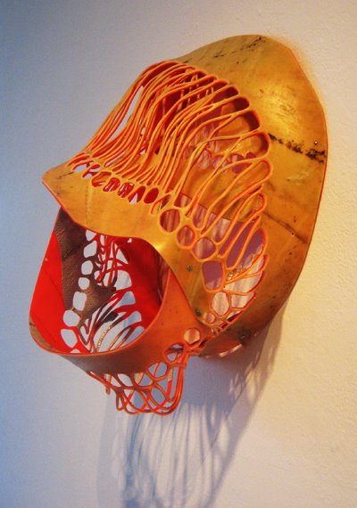
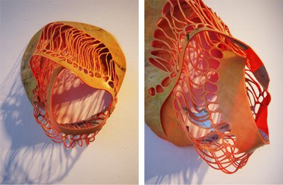
 this orange cocoon-like bio-morphic sculpture used to be a traffic cone. there was also a painting made with pieces of traffic cones, but it was not nearly as successful. it casts a beautiful shadow on the wall (sorry I didn't get a good picture of that). I am soooooo into ordinary things becoming strange.
 this and the next hair piece are both from a show partly curated by Tim Hawkinson (can't really go wrong with this guy. ever)
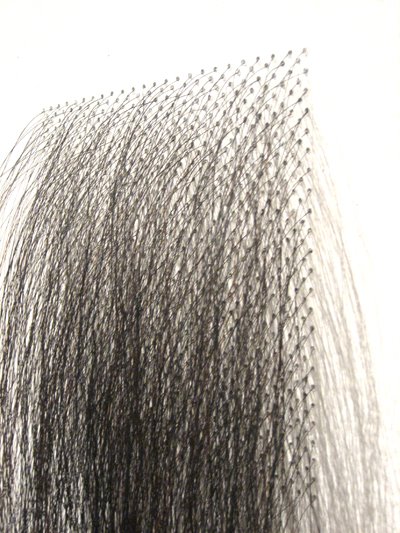
 in case you can't tell what it is - a perfect square shaped grid made of tiny holes drilled into the gallery wall, and out of each hole a single piece of what appears to be human hair sticks out. the height is about the length of a girl's long-ish, past shoulder-length hair. definitely some attraction/repulsion thing going on. except the attraction is more like an obsessive compulsive's (at best. a serial killer's at worst) idea of attraction. guess it's more strange/alarming/creepy/repulsive than attractive. I guess this falls easily in the camp of post-minimalism, where rigid (often geometric) formalism is problemized - in this case, by a biological system.
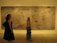 absolutely love this. a giant photo of the areal view of a piece of cement sidewalk. I saw it as an abstract painting at first, and then noticed the couple of cigarrette butts and like, a penny. reminds me of "The Washing of a School Yard", a film by Charles and Ray Eames - exact what it sounds like - areal view still shot of foam and water spreading and washing over the cement of a school yard, forming beautiful psychedelic patterns.
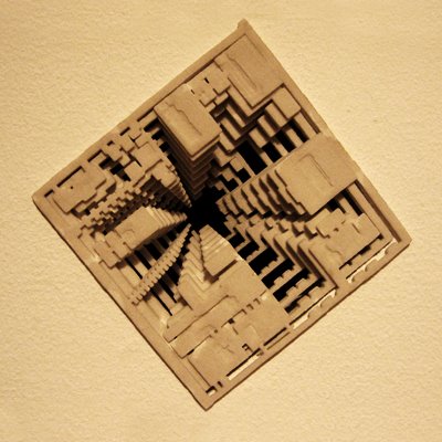

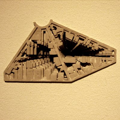 this is one of the only saving graces of the first installment of the Super-Sonic show (entirely arbituary, stupid name), which was comprised of the work of 8 MFA programs of the artschools in the LA area. includes Art Center, Cal Arts, Otis, etc, etc. the second installment did not have a saving grace.
 these are about the size of your palm, and appear to be made of rubber, encased at eye-level into the gallery wall; its concavity is only maybe an inch or 2 deep, but the receding perspective gives it the illusion of depth. there are so many ways to look at this that I'm not going to go into it - maybe it's enough to just say that they are pretty fucking cool.
5 comments:
I discovered your "Different Waters" blog yesterday through a search about Fursaxa, and today I discover your "Same River" blog. As a philosopher, poet and artist, I appreciate the different views your share in these blogs. My own blog features my poetry and artwork (china ink, digital art,...) I invite you to visit it: http://alainvalet.blogspot.com/
confucius, have you seen the 'Zoetrope: All-Story' issue that Tom Waits art directed? It features his 'collection' of oil stains interspersed through the issue. Similar effect to your 'ariel' (areal?) view piece.
I really like the 'cone' work. I like the fact that if it were a darker tone it would be something out of a Giger (or Cronenberg) set, but the 'happy' base tone (burnt orange, literally?) makes it altogether a different effect.
'where rigid (often geometric) formalism is problemized - in this case, by a biological system.'
My own personal combination of attraction, don't worry though...the only serial killing's I do have a bottle cap ;-)
"I really like the 'cone' work. I like the fact that if it were a darker tone it would be something out of a Giger (or Cronenberg) set, but the 'happy' base tone (burnt orange, literally?) makes it altogether a different effect."
"hiding" I think is in general a no-no. by hiding I mean the pretending of a material to be something else, or concealment of how something is made (unless illusion is the point). in this case spray-paint would be a mistake.
"...sorry but I did not take note of the artist's names... prolly should but to me it's the work and the idea that are important."
Ouch! If this was my work you were using on your site I'd be pissed off for the lack of acknowledgement. The ideas you like so much are usually arrived at with a great struggle by those thinking them. Give them their dues.
Great site in any case and a big fan of 'Different Waters". Happy new year!
Post a Comment